Are you tired of the old-fashioned code conflict resolution and scrolling through endless lines of code in different files to find the right one to merge? VS Code now has a built-in Merge Editor that allows you to easily compare and merge changes between branches or files without hassle. This article will guide you through accessing and using this convenient feature that makes any dev’s job easier.
How to Open the Merge Editor in VS Code
When editing a project from GitHub in VS Code, you will automatically get the option to edit conflicts within the Merge Editor in your project window, provided it is enabled in the program’s settings. First off, check whether the merge editor is enabled in the settings.
To do this:
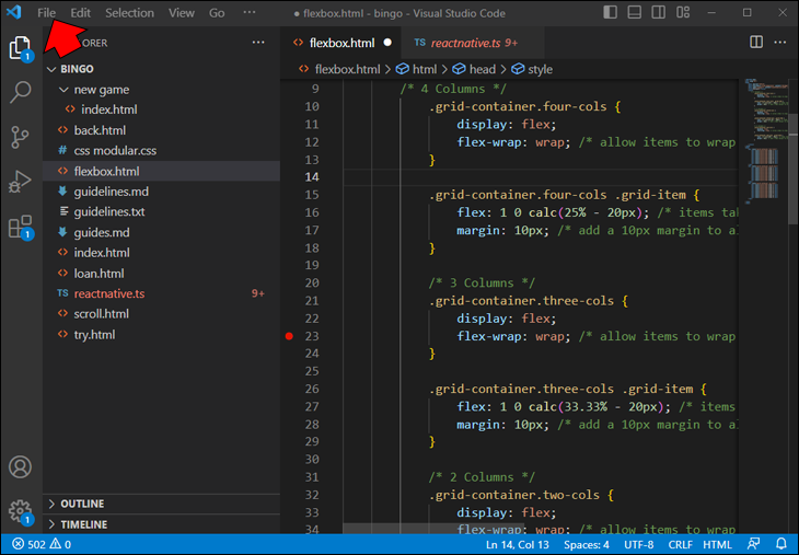
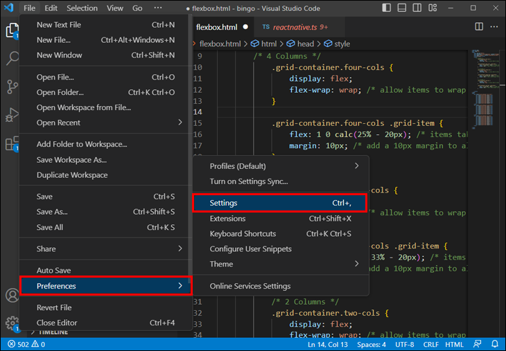
- Click the “File” menu.
- Navigate to the “Settings” menu within the “Preferences” pop-out list.

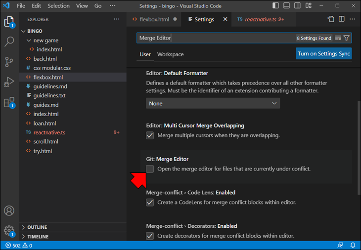
- Search for the “Merge Editor” option.
- Merge editor should be enabled by default, but if it isn’t, tick the checkbox to enable it.

Alternatively, add the following line to the config.json file:
git.mergeEditor: true
Once you’ve enabled the editor correctly, it’s time to compare your requests and resolve conflicts. Load the GitHub repository you want to work on and make your changes. As you work on your project, conflicts between different file versions will occur at some point. When you have a Git conflict, you will get the “Resolve in Merge Editor” option at the bottom right of the project screen. Click this button to open the editor and start resolving the merge conflicts.
What Are Merge Conflicts?
Merge conflicts can arise when merging multiple code branches, each with different commits (changes or additions in the lines of code). Such conflicts usually happen when multiple people have modified the same file or the same line within a file. They may also occur when someone edits a file that another person has deleted.
The more your branch deviates from the original code base, the higher the likelihood of conflicts.
Git usually understands what to do in these cases and automatically handles the merge, since most changes edit different code lines or files. However, it can struggle if the same line of a file or even the same file is affected by separate changes on different branches. You must fix any merge conflicts before you can successfully merge a pull request on GitHub. The merging option will be unavailable for as long as unresolved issues with your code exist.
VS Code will display the conflicts as two sets of modifications, allowing you to accept your current changes, incoming external changes, or both. It will also let you preview the changes before accepting them. However, it will not show you the original unmodified file. If you want to resolve conflicts manually, this may not be enough. That’s where the editor comes into play.
What Is the Merge Editor?
The merge editor is a VS Code feature that allows users to easily reconcile changes made to a file or directory by multiple users or between different repository branches. It is an essential tool for managing source control.
This tool allows you to resolve conflicts between different versions of a file. It provides the “bigger picture” view, giving the user the necessary information to determine how the file should be altered. When you have two versions of a file, the merge editor will let you choose which changes to keep and which to discard.
One of the key benefits of the Merge Editor is its ability to help developers quickly and efficiently resolve merge conflicts, which can be a time-consuming and error-prone process without the right tools. Another benefit of the Merge Editor is its integration with other features of VS Code, such as Git integration and code highlighting. This means that developers can work more seamlessly with their code repository and easily switch between the Merge Editor and other tools in the IDE as needed.
How Does the Merge Editor Work?
The editor compares the file’s contents and presents them side-by-side, in addition to a preview of the final version. The user can then view the differences between the two versions and choose which changes to keep or discard. The editor also allows users to make further changes either version. This process makes it easy to manage and reconcile changes made by multiple users or on different repository branches.
One of the essential features of the Merge Editor is the ability to highlight and resolve conflicts that arise when changes have been made to the same section of code by multiple developers. The Merge Editor presents the changes in the file using color-coded markers that indicate whether each change is from the original version, the incoming version, or a conflict. This allows developers to identify and resolve conflicts and merge changes efficiently and quickly.
Another convenient feature is previewing changes before committing them to the repository. This allows developers to review the merged code, make any necessary adjustments, and ensure the changes are correct before committing to the source control system.
The Merge Editor can also handle complex merges involving multiple files and merge changes from different branches or forks of a codebase. It supports a variety of merge strategies, such as three-way merging, which compares the two versions of the file with the common ancestor to ensure that the changes are merged correctly.
How to Resolve Merge Conflicts with Merge Editor
To help you solve Git merge issues, VS Code provides a three-way merge editor to interactively take in changes and view and edit the merged file. The three-way editor displays these three sections by default:
- Incoming (left) – the external code modifications that conflict with the current code
- Current (right) – the code that the current user is adding to the file
- Result (bottom) – a preview of the file after conflict resolution
Conflicts will be highlighted, and you can use the CodeLens buttons to fix them. Optionally, the user can toggle the view of the original file before either current or incoming changes for more convenient comparison and better decision-making when resolving conflicting code.
After carefully assessing the best course of action for the file you wish to edit, you can choose one of several options:
- Accept current changes and discard the incoming
- Accept incoming changes and discard current
- Accept a combination of both
- Ignore both changes
The merge editor provides an “Accept Combination” button for some conflicts that intelligently merges both changes. This is particularly helpful when the changes do not overlap. On the other hand, if you choose to use the “Ignore” button, the conflict will be marked as resolved without accepting either the incoming or current change, reverting the conflicting area to its initial state.
If you decide to merge both modifications, VS Code will automatically merge the edits when possible. Before committing, you can also undo the changes and select alternative solutions for distinct code snippets since each conflict will be shown separately.
Once you’re happy with your modified file, click the “Complete Merge” button at the bottom right corner of the window. Now, you can compile and commit your merge to GitHub.
Additional FAQ
What are the benefits of using version control in software development?
Version control is an essential tool for software development, offering several benefits, such as tracking changes, collaboration, and maintaining code integrity. It allows developers to work on the same project simultaneously, maintain different codebase versions, and quickly revert to previous versions if necessary. It also helps manage conflicts, ensure code consistency, and facilitate collaboration between team members.
What’s the importance of writing clean code?
Writing clean code is critical for software development as it makes the code easier to read, understand, and maintain. It also reduces the chances of introducing bugs and errors, improves code quality, and makes debugging easier. Clean code adheres to established coding conventions, uses descriptive naming conventions, and avoids duplication. It also follows a logical structure, uses proper indentation, and employs appropriate comments where necessary.
What merge strategies can be used in VC Code Merge Editor?
The Merge Editor also supports different merge strategies, such as the recursive, patience, and subtree. These strategies can be helpful in different scenarios, such as when merging large files, dealing with code formatting conflicts, or merging changes made in a specific subdirectory.
Code Without Conflict
The merge editor in VS Code is a powerful tool that helps developers resolve conflicts when merging code changes. It allows for efficient management of code modifications, providing options to combine or ignore changes and previewing and undoing revisions before committing. Following the previously outlined steps, you can easily open the merge editor and utilize its features to streamline your code merging process.
We hope this article has helped guide you through opening and using the merge editor in VS Code. If you have any questions or comments, please feel free to leave them below. We would love to hear your thoughts and feedback.
Related Posts
 How to Merge PowerPoint Files into a Single File
 How To Merge Tabs in Google Sheets
 How To Merge Two Faces Easily with Several Different Tools
 How To Merge Tabs in Excel
 The Best Instagram Reels Online Editor
 Is CapCut Video Editor Free?
 How to Open the Solution Explorer in VS Code
 How to Open With Live Server in VS Code
 How to Open launch.json in VS Code
Disclaimer: Some pages on this site may include an affiliate link. This does not effect our editorial in any way.