The market for note-taking apps is highly competitive, and Notion definitely stands out in the crowd. Its user-friendly interface and compatibility with many devices are why many users love it.
However, another significant reason Notion is a user favorite is that you can personalize the dashboard with third-party widgets.
Plug-ins such as Indify and Apption are the go-to options for Notion, but other developers have created fun and helpful Notion widgets as well. All you need to do is copy the widget URLs and paste them to your Notion dashboard by using the / command.
20 Best Notion Widgets
Adding a widget to your Notion account is about increasing productivity and functionality and making your workspace look nicer.
Think of all the widgets you have on your smartphone or tablet and the easy access they provide. While you might not be sure what type of widgets you would need or want in Notion, here are the top 20 options to consider.
1. Clock Widget
If you rely on your phone for the time or don’t like squinting to check the tiny numbers that tell the time on your computer, there is a better solution.
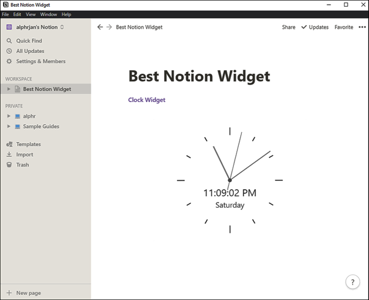
Some Notion users spend a lot of time working on organizing projects and lists and would appreciate having quick access to a clock. The Indify analog Clock widget lets you set the time zone and drag the borders of the clock to increase or decrease it in real-time.

2. Retro Clock Widget
A simple analog clock widget might not be suitable for your Notion page, so if you’re a fan of the digital retro clock style, WidgetBox has a fantastic widget.
You’re not stuck with only being able to customize the background or text color. Instead, you can fully make it your own and quickly integrate it into Notion. This widget will tell you the time and day while fitting into your aesthetics.

3. Weather Widget
A lovely weather widget can make your Notion page look professional. You can check the current temperature at your location, monitor the forecast, and make plans accordingly.
The Indify team has created a minimalistic weather widget that will fit into the Notion page style. All you need to do is copy the link they provide and paste it onto the Notion page you want.

4. Weather Round Widget
If the weather widget discussed above is not your cup of tea, there’s another terrific option to consider from WidgetBox.
Their widgets are super-stylish and offer a wide variety of customization options. You can change the background color of the widget, text, borders, and even the diameter of the widget.

5. Countdown Widget
As the name implies, this widget is perfect if there’s an event you’re looking forward to and want to build anticipation with a countdown.
It could be the birthday of a dear friend, a work event that you’re excited about, or a long-planned vacation that starts in a few days. The countdown widget by Indify will count down the months, weeks, days, hours, and minutes to the main event on your Notion page.
6. Google Calendar
A well-designed calendar is a crucial part of staying organized while you’re busy working on your Notion dashboard. Many users rely on Google Calendar to get their work and personal activities in order.
Now, you can have the well-known calendar app as a widget right on your Notion page. You can make changes to the calendar’s style and embed it into Notion.
7. Spotify Widget
Do you enjoy listening to music or podcasts while working? Then adding a Spotify widget will be a game-changer.
If you already have a Spotify account, then this could be the next logical step. Having your favorite Spotify list right there in Notion means not having to switch from tab to tab to skip tracks or change playlists while working.

8. Apple Music
Another popular music streaming service is Apple Music. Notion users who have a subscription to the platform can make the most out of the Apple Music widget for Notion.
You can visit the Apple Music website, choose a playlist, and from the Share option, copy the embedded code and paste it to a Notion page.

9. Whiteboard Widget
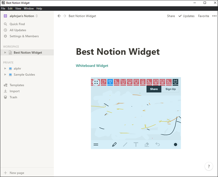
If you’re using Notion for project management, then a whiteboard widget might be of great use to you. A whiteboard is a fantastic space to brainstorm ideas and write down random thoughts when inspiration hits.
Integrating a whiteboard widget for Notion is super simple. Just go to Apption and copy the URL. This widget lets you choose pencils, brushes, and other standard whiteboard tools.

10. Twitter Widget
Keeping track of viral tweets requires frequent scrolling. Instead of picking up your phone to check Twitter or opening a new tab on your browser, why not add a Twitter widget to your Notion page to notify you of tweets of interest?
You can keep up with all the news and updates while working on other vital projects. Your Twitter feed will be within reach, and you won’t even have to interrupt the workflow.

11. Quote Widget
If Notion is the first app you open in the morning, then an inspirational quote might be precisely what you need to see first to get you in the right headspace.
It could be that when productivity drops during the day, a glance at motivating words written on a lovely background could be the boost you need. If you’d enjoy a quote of the day on your Notion page, consider the Quote widget by Indify.

12. Pinterest Widget
If you love daily motivational quotes, as well as kitchen designs, pets, art, and everything in between, a Pinterest widget for Notion might work.
Notion users who love to browse Pinterest will likely enjoy images picked by the widget that correlate with their Pinterest account.
13. Calculator Widget
You have a calculator on your phone and computer. But do you have a cool-looking calculator widget for Notion always at your reach? Probably not.
You don’t need to switch between apps if there are some calculations to be done. It can be distracting and inefficient. But you can use a calculator widget right on your Notion pages for budgeting and keeping your finances in order.

14. Unit Converter Widget
Are you using Notion to create a recipe book? Then you’re likely constantly converting measurements from Celsius to Fahrenheit or dealing with the metric system.
You don’t have to switch to a different tab and Google these calculators every time you need to convert something if you have a helpful Unit Converter widget right there on your Notion page.

15. Greetings Widget
A minimalistic and easy-to-use widget that’s fun and useful will greet you every day and give you the key info you need to start your day.
The Greeting widget wishes you a good morning or good afternoon (depending on when you open Notion) and tells you the day, date, and time. It’s not a fancy widget but will fit right into nearly any Notion page you create.

16. World Clock
Notion users who need to communicate with coworkers or clients who live in other parts of the world need to be mindful of the time zones.
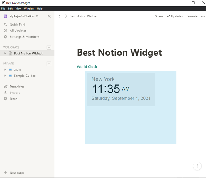
For instance, if you’re in Chicago, you might not be sure what the time is in London, and you don’t want to send a time-sensitive message to someone while they’re asleep. The World Clock widget can help. It looks incredible and shows accurate time in up to three different locations across the world.

17. Pomodoro Widget
Are you struggling to manage time? The Pomodoro Technique has been a lifesaver for many. It helps you manage time better and can be applied to any task.
It encourages you to work 25 minutes at a time and then take a 5-minute break. If it works for you, now you can embed a Notion widget to manage the workflow better.

18. Progress Bar Widget
Keeping track of your daily, weekly, or even annual goals can take a lot of work and dedication. To make it a little easier, you can use the Progress Bar widget designed for Notion.
It can help you keep the time you’ve spent on a goal in perspective and ensure you stay on track with the plan.
19. Astro Charts Widget
This widget might not be for everyone, but many will love it. If you’re a fan of astrology and check your horoscope chart every day, the Astro Charts widget will be the perfect addition to your Notion page.
It might not seem like it would have an impact on productivity, but if your horoscope motivates you, then it’s the perfect addition.

20. Giphy Widget
A funny GIF can brighten your day and put you in the right mood to continue working and managing projects.
Instead of wasting time scrolling through endless amounts of GIFs online, enjoy a daily GIF provided by the GIPHY widget. It will make your Notion page more interactive and fun and might even get those creative juices flowing.

Using Notion Widgets to Your Advantage
Not every widget you’ll add to a Notion page will be aimed toward promoting productivity. Some are there to provide a little reprieve from work and make you laugh.
There’s something for everyone when it comes to Notion widgets, and new widgets are always in development.
The clock, weather, and music streaming service widgets are popular options, but there are other excellent ways to customize and optimize your Notion pages. Several third-party sources have something available for users at all times.
Which Notion widgets would you add to your dashboard and pages? Let us know in the comments section below.
Disclaimer: Some pages on this site may include an affiliate link. This does not effect our editorial in any way.


